The Ultimate Design Principles Guide For Developers
Bridging The Gap Between The Designers and Developers
Whether you’re a developer who wants to enhance your design skills or a designer who wants to wrap up the fundamental stuff that you need to learn, this guide is for you.
Given the length of this guide, I have splitted it into different parts, so feel free to read a bit, take a break, and come back to read more.
Table of Contents
- The Role of Design in Development and its Importance for Developers
- Visual Design Basics
- User Experience (UX) Design
- Responsive and Mobile-Friendly Design
- Accessibility in Design
- Collaboration with Designers
- Design Tools and Software
- Integrating Design and Development Workflow
- A/B Testing and Data-Driven Design
Chapter 1: The Role of Design in Development and its Importance for Developers
Design and development are intertwined disciplines that shape the digital world. As a developer, understanding design principles is crucial. It goes beyond aesthetics, impacting user satisfaction and the overall success of a product. By incorporating design principles, you can create visually captivating experiences that leave a lasting impression on users.
The Significance of Design in Development
Design is the process of creating something to fulfill a purpose. It can be applied to anything, from physical objects to digital products. In the context of development, design is the process of creating user interfaces that are easy to use, visually appealing, and aligned with the brand’s identity.
Good design goes beyond aesthetics.
Good design is essential for creating successful products. It can help to improve user experiences, increase engagement, and boost conversion rates. When done well, design can also help to differentiate a product from its competitors and build brand loyalty.
Why do Developers need to Understand Design Principles?
While developers excel in coding and implementing functionality, having a solid understanding of design principles is essential to their success. Here are a few reasons why developers should invest time in learning design:
- Collaboration: Working closely with designers is common in development projects. Understanding design principles helps developers effectively communicate and collaborate with designers, resulting in smoother workflows and better outcomes.
- User-Centricity: Design puts users at the forefront, emphasizing their needs, behaviors, and preferences. Developers who understand design principles can create user-centric experiences, ensuring that their products are intuitive, enjoyable, and aligned with user expectations.
- Implementation Efficiency: When developers understand design principles, they can anticipate and account for design considerations during the development process. This leads to more efficient implementation, fewer design-related issues, and faster development cycles.
- Problem-Solving: Design is not only about aesthetics but also about solving problems. By understanding design principles, developers can approach design challenges with a problem-solving mindset, finding innovative and effective solutions.
- Versatility: In smaller teams or startups, developers often wear multiple hats, including design responsibilities. Having design knowledge allows developers to handle design tasks independently, saving time and resources.
Developers who understand design principles can create better digital products. They can bridge the gap between design and development, and create products that are both user-friendly and visually appealing.
Chapter 2: Visual Design Basics
Visual design plays a pivotal role in creating engaging and aesthetically pleasing digital experiences. As a developer, having a solid understanding of visual design principles is essential for crafting visually compelling and user-friendly applications. This chapter explores the fundamental elements of visual design and their significance in the development process.
Color Theory and Color Palettes
Color theory is the study of how colors interact with each other. It is a complex and ever-evolving field, but there are some basic principles that developers should understand.
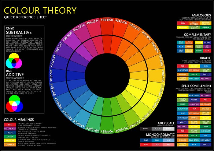
Developers should know these principles:
- Color harmony: The use of colors that work well together. There are many different ways to achieve color harmony, but some of the most common methods include using analogous colors, complementary colors, and triadic colors.
- Contrast: The difference between two or more colors. It can be used to create a sense of depth, interest, and excitement in a design. There are two main types of contrast: hue contrast and value contrast.
- The emotional impact of different color combinations: The way that colors can evoke different emotions in people. For example, red is often associated with excitement and passion, while blue is often associated with calmness and peace.
Typography and Font Selection
Typography is the art of arranging type. It is a critical element of visual design, as it can be used to convey information, create a sense of hierarchy, and establish a visual identity.
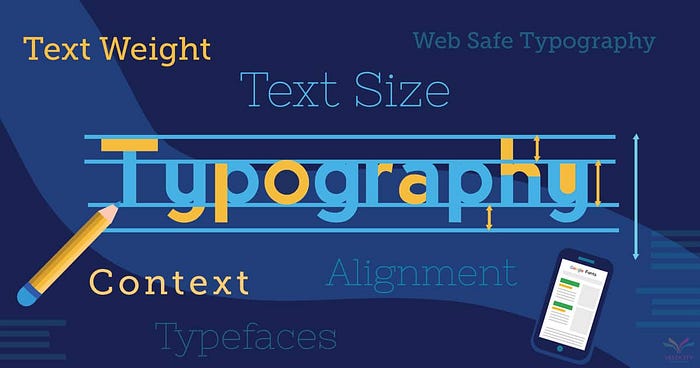
Developers should familiarize themselves with the following concepts of typography:
- Font families: A group of fonts that share the same basic design. There are many different font families available, each with its own unique characteristics. Some popular font families include Arial, Times New Roman, and Helvetica.
- Font styles: Variations of a font family. For example, a font family might include regular, italic, and bold styles. Font styles can be used to create a sense of hierarchy or to emphasize certain parts of the text.
- Typographic hierarchy: The arrangement of text in order of importance. It is used to guide the user’s eye and ensure that the most important information is seen first. Typographic hierarchy can be created using a variety of techniques, including font size, font weight, and color.
Layout and Composition Principles
Layout and composition are the principles that govern how elements are arranged in a design. They are essential for creating visually appealing and user-friendly interfaces.
A well-designed layout creates a clear visual structure and guides users through the content. Developers should understand these principles:
- Balance: The distribution of visual weight throughout a design. A balanced layout will feel stable and harmonious.
- Alignment: The way that elements are aligned with each other. A well-aligned layout will feel orderly and structured.
- Proximity: The distance between elements. Elements that are close together are perceived as being related, while elements that are far apart are perceived as being less related.
- Whitespace: The empty space around elements. Whitespace can be used to create a sense of balance, to improve readability, or to highlight important elements.
Use of White Space and Visual Balance
White space is not empty space. It is a valuable design element that can be used to create a sense of balance, improve readability, and highlight important elements.

Developers should learn to utilize white space effectively to create a balanced composition. This means using white space to balance out the visual weight of different elements in the design. For example, a large image can be balanced out by using white space around it.
Visual Hierarchy and Information Organization
Visual hierarchy is the arrangement of elements in a design in order of importance. It is used to guide the user’s eye and ensure that the most important information is seen first.
Developers can use a variety of techniques to create a visual hierarchy, including:
- Size: Larger elements are perceived as being more important than smaller elements.
- Color: Brighter colors are perceived as being more important than darker colors.
- Contrast: Elements that contrast with each other are perceived as being more important than elements that blend in.
- Placement: Elements that are placed in prominent locations are perceived as being more important than elements that are placed in less prominent locations
Read more about The Visual Hierarchy and Information Organization
Iconography and Illustration Guidelines
Iconography and illustration are essential visual elements that enhance usability and convey meaning. Icons are small, pictographic representations of objects or actions. Illustrations are more detailed images that can be used to tell a story or provide information.
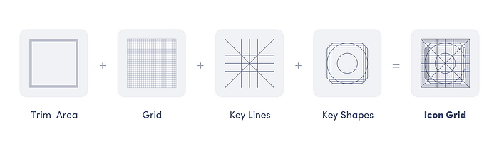
Developers should understand the principles of icon design, such as:
- Simplicity: Icons should be simple and easy to understand. They should not contain too much detail or clutter.
- Clarity: Icons should be clear. The meaning of the icon should be immediately obvious to the user.
- Consistency: Icons should be consistent with each other. This means using the same style and format for all icons.
Chapter 3: User Experience (UX) Design
User experience (UX) design is the process of designing products and services that are easy to use, efficient, and enjoyable for users. UX designers focus on the user’s needs and wants, and they use a variety of methods to create designs that are effective and satisfying.
Understanding User-Centered Design (UCD)
User-centered design (UCD) is a design approach that puts the user at the center of the design process. This means that developers must understand the user’s needs, wants, and goals to create a product that is effective and satisfying.
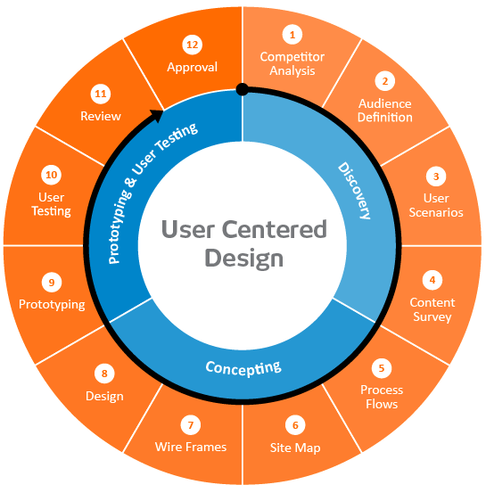
There are many principles of UCD, but some of the most important include:
- Empathy: Developers must empathize with the user and understand their needs and wants. This can be done through user research, such as interviews, surveys, and usability testing.
- User-centered thinking: Developers must think about the user at every stage of the design process, from ideation to implementation. This means considering the user’s needs and wants when making decisions about the product’s features, functionality, and usability.
- Iterative design: The design process is iterative, which means that it is constantly evolving. Developers should get feedback from users early and often, and use this feedback to improve the design.
- Collaboration: UCD is a collaborative process that involves working with a variety of stakeholders, including users, designers, developers, and testers. By collaborating with these stakeholders, developers can create a product that meets the needs of all involved parties.
Read more about The Understanding User-Centered Design (UCD)
Wireframing and Prototyping Techniques
Wireframing and prototyping are two essential techniques for translating ideas into tangible designs.
Wireframing is a quick and easy way to visualize a design. It can be done using pen and paper or with a variety of software tools. Wireframes can be used to get feedback from users early in the design process and to make changes to the design before it is finalized.
Prototyping is a more advanced technique that allows developers to build interactive models of the user interface. Prototypes can be used to test the usability of the design and to get feedback from users.
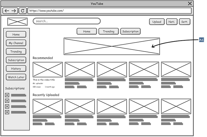
Creating Effective Calls-to-Action (CTAs)
Calls-to-action (CTAs) are a critical part of any user interface. They are the elements that prompt users to take a desired action, such as clicking a button, filling out a form, or making a purchase.
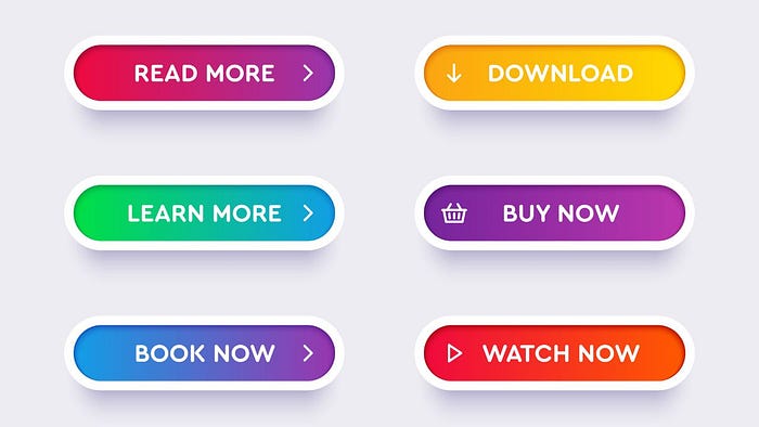
There are a few key things to keep in mind about effective CTAs:
- Using clear and concise language: The text of the CTA should be clear and concise.
- Using strong action verbs: The CTA should use strong action verbs that tell the user what to do. For example, instead of saying “Learn more,” say “Sign up now.”
- Making the CTA stand out: The CTA should stand out from the rest of the content on the page. This can be done by using a different color, font, or size than the other text.
- Placing the CTA in a prominent location: The CTA should be placed in a prominent location where users are likely to see it. This could be at the top of the page, the bottom of the page, or next to the content that the CTA is related to.
Chapter 4: Responsive and Mobile-Friendly Design
In our increasingly digital world, users access applications and websites from an array of devices with varying screen sizes. This means that developers need to create designs that are responsive and mobile-friendly.
Responsive design is a way of designing websites and applications that adapt to the size of the device they are being viewed on. This ensures that users have a consistent and user-friendly experience regardless of the device they are using.
Designing for Multiple Screen Sizes and Resolutions and Fluid Grid Systems
The digital landscape spans from large desktop monitors to small mobile screens. Developers must grasp the fundamentals of designing for diverse screen sizes and resolutions to ensure their products look and function optimally across devices.
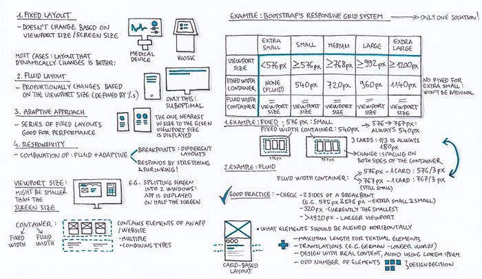
Here are some of the key principles of designing for multiple screen sizes and resolutions:
- Using flexible layouts: Layouts should be flexible enough to adapt to different screen sizes and resolutions. This can be done using CSS media queries or Flexbox.
- Using responsive images: Images should be resized to fit the available space. This can be done using CSS or by using an image resizing service.
- Using clear and concise navigation: Navigation should be easy to use and navigate on all devices. This can be done by using a simple and consistent navigation structure.
Read more about Designing for Multiple Screen Sizes and Resolutions
Mobile Interaction Patterns and Gestures
Mobile devices are touch-based, which means that users interact with them by touching the screen. This introduces a new set of challenges for developers, who need to design interfaces that are intuitive and easy to use with touch.
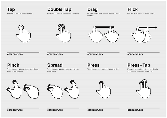
Here are some of the common mobile interaction patterns that developers should understand:
- Tap: Tapping is the most common touch interaction. It is used to select an item, activate a button, or open a link.
- Swipe: Swiping is used to scroll through a list or view, or to move between different screens.
- Pinch: Pinching is used to zoom in or out of an image or map.
- Drag and drop: Drag and drop is used to move an item from one place to another.
- Rotation: Rotation is used to change the orientation of an item, such as a map or image.
- The size of the screen: The size of the screen will affect the size and spacing of elements in the interface.
- The resolution of the screen: The resolution of the screen will affect the clarity of images and text.
- The capabilities of the device: The capabilities of the device, such as the processor and memory, will affect the performance of the interface.
Chapter 5: Accessibility in Design
Accessibility is the design of products and services that can be used by everyone, regardless of their abilities. This includes people with disabilities, such as visual impairments, hearing impairments, mobility impairments, and cognitive impairments.
Introduction to Web Accessibility Standards (WCAG)
The Web Content Accessibility Guidelines (WCAG) provide a comprehensive framework for creating accessible web content. WCAG is a set of guidelines developed by the World Wide Web Consortium (W3C) to help make the web more accessible to people with disabilities.
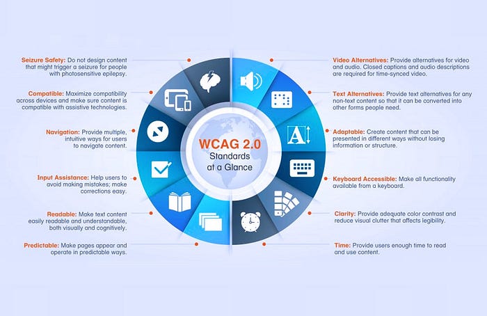
WCAG is divided into three levels of conformance:
- Level A: The lowest level of conformance. Level A guidelines are considered to be the minimum requirements for accessibility.
- Level AA: A higher level of conformance. Level AA guidelines provide more accessibility features and are recommended for most websites.
- Level AAA: The highest level of conformance. Level AAA guidelines provide the most accessibility features and are recommended for websites that need to be accessible to the widest range of users.
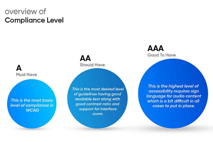
There are a number of tools that can be used to test for WCAG compliance, such as axe and TAW.
The WCAG guidelines cover a wide range of topics, including:
- Text alternatives: Providing text alternatives for non-text content, such as images and videos.
- Keyboard navigation: Make sure that all content can be navigated using only a keyboard.
- Contrast: Using high-contrast colors to make text and images easy to read.
- Labels: Providing clear and concise labels for all elements.
- Structure: Organizing the content in a way that is easy to understand.
- Reusable content: Using accessible markup to make content easier to reuse and adapt.
Designing for Users with Disabilities (Visual, Auditory, Motor, Cognitive)
Designing for users with disabilities requires a thoughtful approach. This is because people with disabilities experience the world differently, and what works for one person may not work for another. By understanding the different types of disabilities and how they impact users, developers can create designs that are inclusive for everyone.

There are three main types of disabilities: visual, auditory, and motor.
- Visual disabilities include blindness, low vision, and color blindness. People with visual disabilities may not be able to see the text or images on a website or application. Therefore, it is important to use high-contrast colors and clear and concise text. It is also important to provide alternative text for images and multimedia content.
- Auditory disabilities include deafness and hearing loss. People with auditory disabilities may not be able to hear audio content, such as music or videos. Therefore, it is important to provide transcripts or captions for all audio content.
- Motor disabilities include paralysis, tremors, and arthritis. People with motor disabilities may have difficulty using a mouse or keyboard. Therefore, it is important to make sure that the website or application can be navigated using other input methods, such as keyboard shortcuts or voice commands.
- Cognitive disabilities include intellectual disability, autism spectrum disorders, severe, persistent mental illness, brain injury, stroke, Alzheimer’s disease, and other dementias. People with cognitive disabilities may have difficulty understanding complex information, following instructions, or remembering things.
Read more about Designing for Users with Disabilities (Visual, Auditory, Motor)
Color Contrast and Text Readability Guidelines
Adequate color contrast and text readability are essential for users with visual impairments.
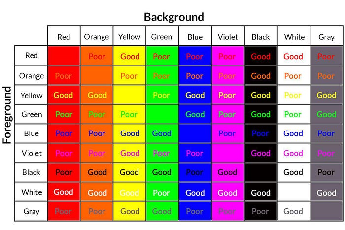
The following guidelines can help you create websites and applications that are accessible to everyone:
- Using high-contrast colors for text and backgrounds. The WCAG 2.1 standard recommends a minimum contrast ratio of 4.5:1 for normal text and 3:1 for large text. You can use a contrast checker to test the contrast ratio of your colors.
- Using clear and concise text. Avoid using small fonts, thin fonts, or decorative fonts. Use a font size of at least 16px for body text.
- Using white space to break up text and make it easier to read.
- Using the proper headings and subheadings to structure the content.
- Using proper images and videos sparingly, and providing alternative text for all images and videos.
Providing Alternative Text for Images and Multimedia
Alt text provides textual descriptions for images and multimedia content. It is essential for users who are blind or have low vision, as they cannot see the images themselves.
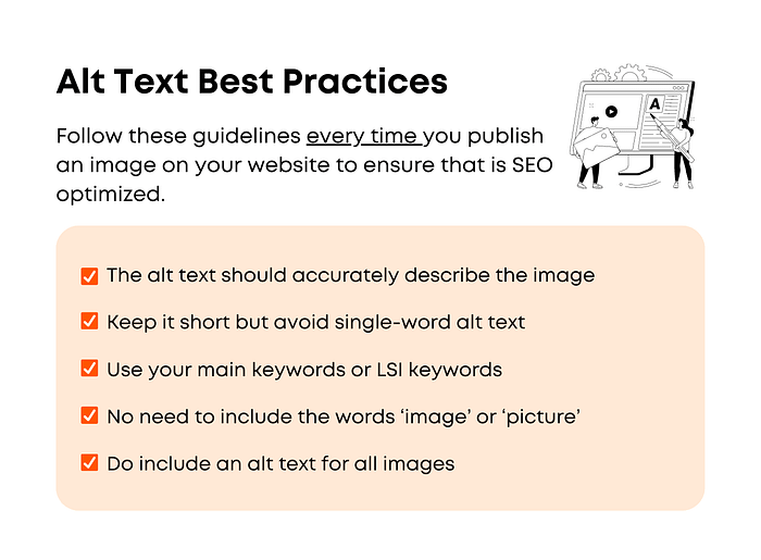
Alt text should be descriptive and meaningful, and it should convey the content and context of the image.
Chapter 6: Collaboration with Designers
The synergy between developers and designers is instrumental in creating outstanding digital experiences.
Effective Communication with Designers
Strong communication is essential between developers and designers. This includes being able to convey technical considerations and design constraints effectively. By doing so, you can foster a collaborative environment that leads to better design outcomes.
Don’t just say “I need this to look good.” Be specific!
Here are some tips for effective communication with designers:
- Use clear and concise language. Avoid jargon and acronyms that the designer may not be familiar with.
- Be specific about your needs. Tell the designer what you like and don’t like about the current design.
- Be open to feedback. The designer may have some great ideas that you hadn’t thought of. Be open to their feedback and be willing to make changes.
- Be respectful of the designer’s time. Don’t bombard them with emails or requests. Schedule regular meetings to discuss the project.
Understanding Design Briefs and Creative Constraints
A design brief is a document that outlines the project goals and constraints. It is important for developers to understand the significance of design briefs and how they can be used to align technical possibilities with design aspirations.
Here are some things to look for in a design brief:
- The project goals: What are the overall goals of the project?
- The target audience: Who are the users of the product?
- The functionality: What features does the product need to have?
- The aesthetic: What is the desired look and feel of the product?
- The budget: How much money is available for the project?
- The timeline: When does the product need to be completed?
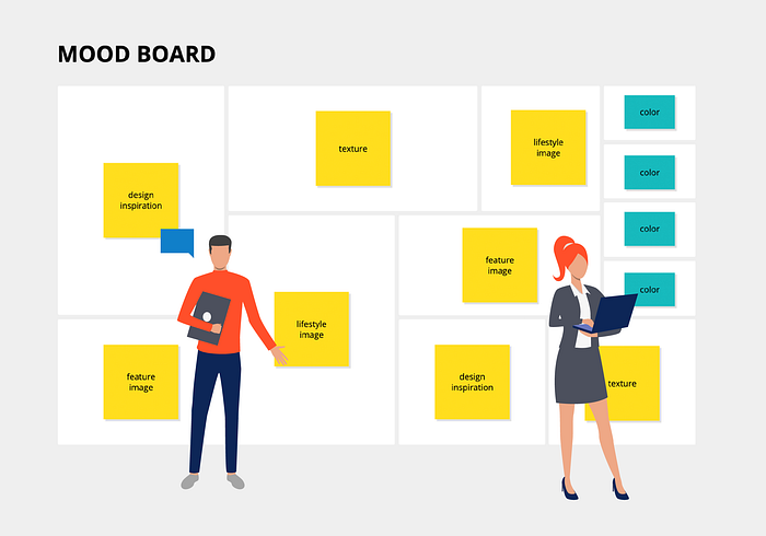
Collaborating on Mood Boards and Style Guides
Mood boards and style guides provide a visual reference for design direction. They can be used to communicate the designer’s vision to the developer and to ensure that design choices are consistent throughout the project.
Here are some tips for collaborating on mood boards and style guides:
- Get involved early in the process. The sooner you start collaborating, the better.
- Provide feedback early and often. Don’t wait until the end of the process to make changes.
- Be respectful of the designer’s vision. The designer has put a lot of time and effort into creating the mood board or style guide. Be respectful of their vision and work with them to make changes that you both agree on.
Giving and Receiving Design Feedback
Constructive feedback is pivotal in refining design concepts. It is important for developers to be able to provide valuable feedback to designers and to effectively incorporate their feedback into their development process.
Here are some tips for giving and receiving design feedback:
- Be specific. Don’t just say “I don’t like it.” Tell the designer what you don’t like and why.
- Be constructive. Offer suggestions for how the design can be improved.
- Be respectful. Remember that the designer has put a lot of work into the design. Be respectful of their efforts and be willing to compromise.
Resolving Design-Development Workflow Challenges
Discrepancies between design and development can arise. It is important to have strategies in place for addressing these challenges and fostering a smoother workflow that minimizes disruptions and ensures successful project outcomes.
Here are some tips for resolving design-development workflow challenges:
- Communicate early and often. Keep the designer and developer updated on each other’s progress.
- Be flexible. Be willing to adjust the design or development process as needed.
- Use version control. This will help to track changes and prevent conflicts.
- Use a collaborative design tool. This will make it easier to share and review designs.
By following these tips, developers, and designers can collaborate effectively and create outstanding digital experiences.
Chapter 7: Design Tools and Software
In the modern development landscape, designers and developers collaborate using a range of specialized tools and software. This chapter is dedicated to understanding the tools that bridge the gap between design and development, enabling seamless communication and efficient workflow.
Design software is used to create visual representations of ideas. It can be used to create everything from simple sketches to complex illustrations and animations.
Some popular design software programs include:
- Adobe Creative Suite: This suite of software includes programs for photo editing, vector graphics, and animation.
- Sketch: This vector graphics program is popular for its user-friendly interface and its ability to create interactive prototypes.
- Figma: This cloud-based design tool is becoming increasingly popular for its collaborative features and its ability to export designs in a variety of formats.
- Zeplin: This tool allows developers to extract assets and design specifications from Figma and Sketch designs.
By knowing a little bit about these tools, developers can enhance collaboration with designers and streamline the design and development process.
Chapter 8: Integrating Design and Development Workflow
Creating exceptional digital products requires a seamless integration between design and development workflows. This chapter delves into strategies that bridge the gap between these two disciplines, ensuring efficient collaboration and successful project outcomes.
Bridging the Gap Between Design and Code
The design and development process can be challenging because designers and developers often speak different languages. Designers think in terms of visuals, while developers think in terms of code.
To bridge the gap between these two disciplines, it is important for developers to understand the basics of design and for designers to understand the basics of code.
Here are some tips for bridging the gap between design and code:
- Take design courses or tutorials.
- Read design books and articles.
- Talk to designers and ask questions.
- Experiment with design tools and software.
- Ask the designer to learn the basics of HTML, CSS, and JavaScript.
Implementing Design Systems and Component Libraries
Design systems and component libraries can help to bridge the gap between design and development by providing a common vocabulary and set of tools for both disciplines.
- Design systems are a collection of design principles, patterns, and assets that can be used to create consistent and user-friendly interfaces.
- Component libraries are a collection of reusable code components that can be used to build complex interfaces quickly and easily.
Here are some tips for implementing design systems and component libraries:
- Start small and build up your library over time.
- Make sure the design system is flexible enough to accommodate changes.
- Get feedback from designers and developers.
- Document the design system so that everyone can understand it.
Efficient Design-Development Handoff Practices
The design-development handoff is the process of transferring design assets to developers. This is a critical step in the development process.
It is important to have efficient handoff practices in place to minimize misunderstandings and streamline the development process.
Here are some tips for efficient design-development handoff practices:
- Use a collaborative design tool that allows designers and developers to work together on the same files.
- Create clear and concise design specifications.
- Provide developers with all the assets they need to implement the design.
- Conduct regular design reviews with developers.
Conducting Regular Design and Code Reviews
Regular reviews of both design and code can help to identify and fix problems early on in the development process. This can help to ensure that the final product is of the highest quality.
Here are some tips for conducting regular design and code reviews:
- Get feedback from a variety of people, including designers, developers, and users.
- Be constructive and focus on improving the product, not on criticizing the people who created it.
- Be open to feedback and be willing to make changes.
Chapter 9: A/B Testing and Data-Driven Design
In the digital world, decisions backed by data can be the difference between good and great. This chapter delves into the powerful realm of A/B testing and data-driven design, showing how these methodologies can fine-tune your creations for optimal user experiences.
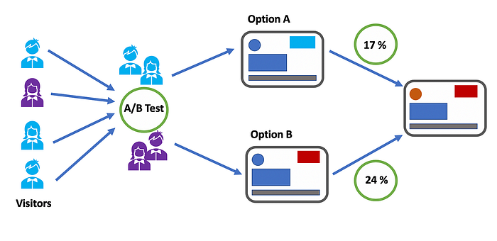
Understanding A/B Testing
A/B testing is a method of comparing two versions of a design element to determine which performs better. For example, you could A/B test two different button colors to see which one has a higher click-through rate.
Once you have collected data from A/B tests or other sources, you can use that data to improve your designs iteratively. This means making small changes to your designs over time, based on the data you collect.
Optimizing User Journeys
Data-driven design can also be used to optimize user journeys. By understanding how users interact with your designs, you can identify bottlenecks and drop-offs in the user journey. You can then make changes to your designs to improve the user experience and reduce drop-offs.
A user journey is the path that a user takes through your website or app.
Conclusion
In this article, we explored the intersection of design and development.
We discussed the importance of design in creating exceptional digital experiences and why developers need to understand design principles.

